The Scatter Chart (Summary) Widget
You can compare the values from 2 selected metrics on the dashboard using the Scatter Chart widget. See Widgets Overview for information about how to add each widget and additional options.
Adding Scatter Chart Widgets to Dashboards
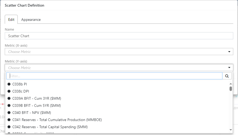
- Set up the Scatter Chart.
- Enter the name for the chart in the Name field
- Click OK to create the chart.
- Resize and reposition the widget, as required.

Click image to expand or minimize.
Chart Widget Options
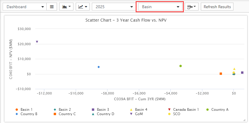
- Use the Group control on the Dashboard to display a scatter chart for the metrics per-group value.
- Use the Time filter control on the dashboard to summarize series metrics. 'All' is the series total, otherwise summarize to the selected date. Scalar metrics are not affected.

Click image to expand or minimize.
